.png)
Let's look at a typical post on LinkedIn:
__________________________________________
B2B content is broken.
But it's not a writing problem. It's a strategy problem.
👉More blog posts.
👉More LinkedIn carousels.
👉More webinars.
👉More "thought leadership."
And somehow…
Your traffic is flat.Your pipeline is empty.Your CMO is panicking.Here’s the uncomfortable truth:
None. Of. This. Is. Working.
Why?
You're creating content for algorithms, not humans.You're chasing trends, not building authority.You're outsourcing strategy to writers who've never sold anything.Brutal? Yes.
Fixable? Also yes.
Because once you stop playing the content game…You can actually start winning it.
__________________________________________
Nobody wrote that. ChatGPT did.
Formatting used to be one of the biggest gaps in B2B content. Most articles were wall-of-text disasters. Writers who bothered with clever subheads, scrollable tables of contents, paragraph breaks, white space, and authentic visuals stood out, and their blogs got bookmarked.
Now AI formats everything for you. The output is readable and easy to scan. It's also recognizable.
Formatting is the fifth dimension in the Content Quality Score. And one AI made boring.
In today's newsletter:
Every AI-written post has the same beat:
Anything in marketing that repeats this much becomes invisible. It's like the phrases "game-changing” or "revolutionary” that got worn down to nothing.
So whatever you write using the recognizable AI rhythm loses weight, people skip it, even if the ideas are interesting. Readers just think: “I’ve seen this before.”
Now, when SEO became AEO and everybody is concerned about showing up in AI searches, I keep seeing the same tactics shared by “AI visibility experts”: Add FAQ blocks. Use schema markup. Structure your content as Q&A so LLMs can pull from it.
But if your formatting only exists to feed LLMs, you've optimized for a machine while losing the human reading the page. People don't read schema markup. They read content. And they bounce fast if it bores them.
To do that, content needs to be readable, which means visuals, white space, short paragraphs. (I wrote about readability here, if you're curious what that meant in the pre-AI era.)
Things that work:
Things that don't work:
But all of that is the easy part you can cover while editing your draft. Here's where most agencies still lose.
Most writers create content in Google Docs, and whatever they write — a case study, a landing page, an about us page, a report — they make it look like an article.
Article? Headers and paragraphs. Case study? Headers and paragraphs. Landing page? Headers and paragraphs.
Same plate for the sushi, the steak, and the soup.
Here's a typical draft of a case study:
Generic title. Three paragraphs of warm-up before anything happens. The designer has to invent a layout from scratch.
At Zmist & Copy, we format every draft differently depending on what it is. The writer ships a structure designers and clients can recognize on sight.
For example, our articles open with a TL;DR box so the reader knows what they're getting in 5 seconds. Expert quotes are formatted as callouts, with the expert's photo and credential. Section breaks have visual weight so the eye has somewhere to land.
Case studies open with a stats panel that makes the result visible before the reader scrolls. "About the client" comes next with logos. The challenge breakdown uses a structured two-column layout where every problem gets its own row instead of disappearing into a paragraph.
Landing pages are broken down into sections that make it clear how to design them. By the way, I used the same approach when I asked my sister to redesign our Zmist & Copy website, and she even posted about that on her Linkedin. When the designer doesn't have to guess what the writer meant, it speeds up design and makes the result better.
Here is an example of a homepage we wrote for one of our clients, where we used our on-brand Google Doc wireframe.
This is what makes formatting count toward Quality Score 5: it's not just readable, it's recognizable for the format.
You can check out more examples of how we write landing pages on this self-built Lovable app.
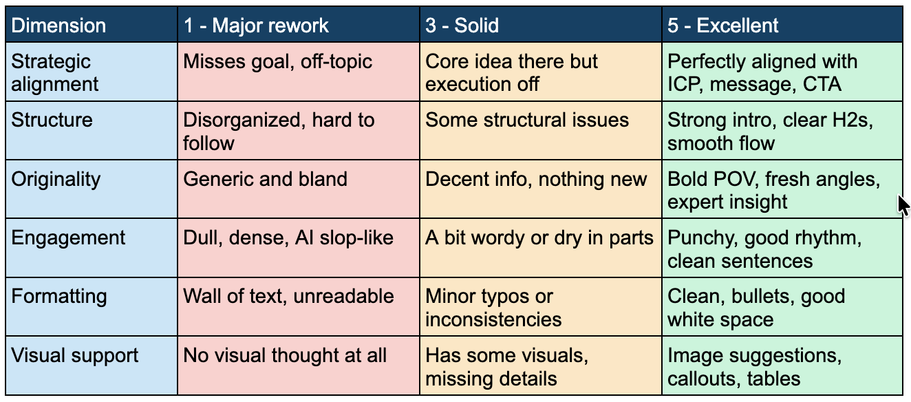
Score: 1 - Wall of text, OR default AI rhythm (bullet every 3 sentences, bold every other line). Generic headers like "The Challenge." No structural difference between an article, a case study, and a landing page.
Score: 3 - Readable, but the same skeleton on every piece regardless of format. Bullets are fine, paragraphs are fine, but the client can't tell what type of page they've landed on without reading.
Score: 5 - A reader can scan in 5 seconds and know exactly what they're looking at. Articles, case studies, and landing pages each have their own visible structure. There is white space, rhythm that doesn't follow AI patterns, and there are visuals that makes sense. The way the piece is formatted looks unique.
I keep a folder of B2B content I see that doesn't look AI-formatted. If you've come across anything good recently, send it my way.
Next edition is the last in the Content Quality Score series: Visual Support.
In previous chapters:
Kateryna
P.S. If we aren't connected already, follow me on LinkedIn and Instagram. If you like this newsletter, please refer your friends.
P.P.S. Need help with quality content? Zmistify your content with Zmist & Copy.


If you needed to write an article that motivates people to quit smoking, would you focus on facts and statistics or include your personal story? The truth is, using facts to change someone's mind doesn't always work. Sometimes you need an emotional angle. Read this article to learn how to persuade using emotions.

Educational content isn't dead (if you do it right)
Subscribe to From Reads to Leads for real-life stories, marketing wisdom, and career advice delivered to your inbox every Friday.