.png)
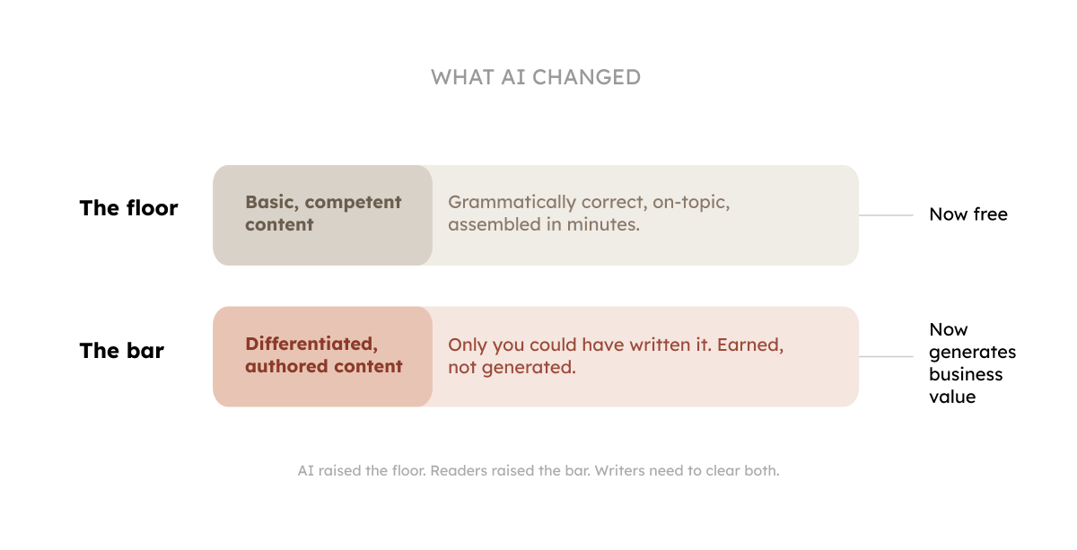
A couple of years ago, content marketers were debating whether AI could write. Now we've moved past that. As Ahref's Ryan Law put it, AI can produce content that's indistinguishable from the vast corpus of human-written content produced by content marketers. I'll admit, sometimes it's even better than what many professional writers were producing before AI.
That debate is over. Now we're all in an uncomfortable zone.
When the writing barrier disappeared, everyone started publishing. A product manager can spin up a 1,500-word blog post in four minutes. An intern can generate a LinkedIn carousel before lunch. Your competitors have access to the same tools and the same ability to cover any topic good enough and quickly.
In content marketing, publishing is no longer a differentiator.
The thing that actually determines whether your content generates any business value, is producing content that sounds like something only you could have written.
AI did two things.
This changes what you need from your in-house writers. And it changes how you measure them.
______________________
TAKE THE SURVEY: We're building a report about how AI changed things in the content and SEO corner. If you're a CMO, Head of Content, Content Lead, or work closely with content operations, could you please share your answer in this short form? It takes only 2 minutes.
______________________
In today's newsletter: (it's a long one)
Content writers aren't responsible for MQL, SQL, or CPL. That's on the marketing side. But that doesn't mean writers operate without accountability.
Writers need KPIs that reflect what they control:
We call it the Two-Layer Writer KPI System. The first layer measures quality before a piece is published, when you can still do something about it, and the second layer measures engagement after, when the market tells you whether your judgment was right. The first layer keeps standards from drifting. The second layer tells you whether they're set at the right height.
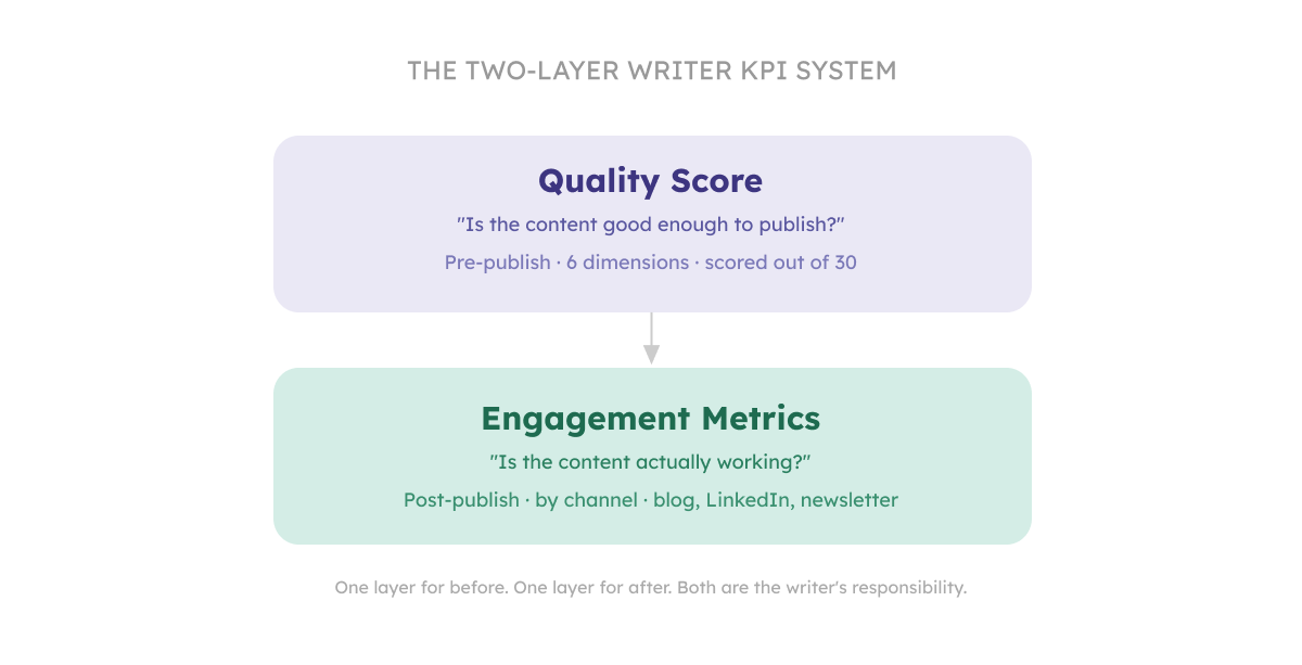
The most important signal about a piece of content is whether it's actually good before it goes live.
Engagement metrics tell you how content performed; the quality score tells you why.
We score every article across six dimensions, each rated 1, 3, or 5:
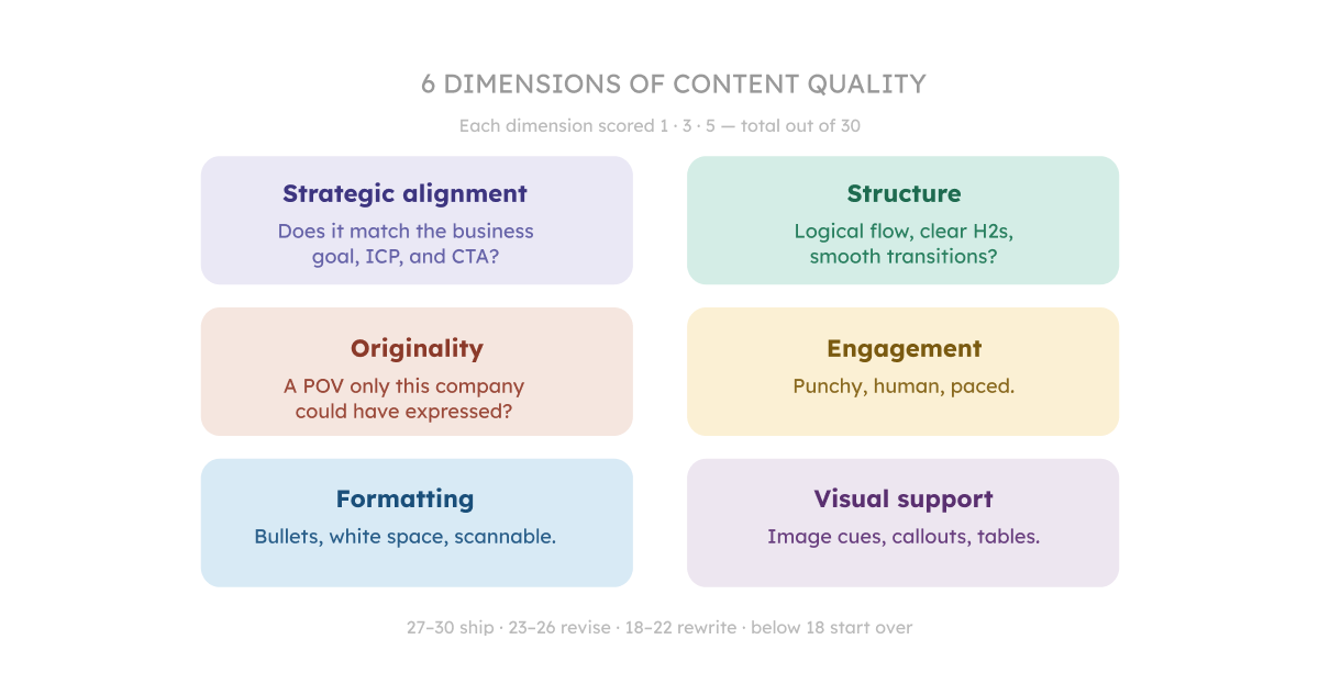
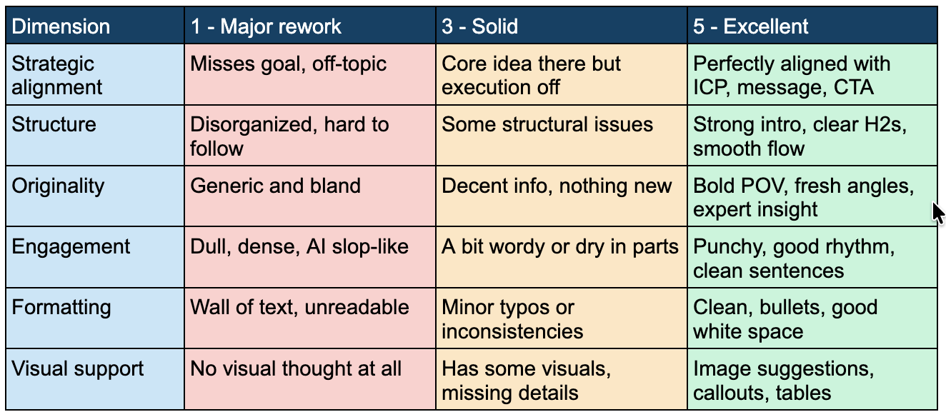
How to read the score:
Why make this a writer KPI?
Because it moves quality from a subjective editorial opinion ('I think this needs more personality') to a clear target. A writer who consistently scores 25+ knows what good looks like for this business. A writer stuck at 16-18 has a specific growth path.
Run the score before every article is published, track it over time and look for patterns: is your team consistently weak on Originality? That's your editorial coaching focus for the next quarter.
Now that we’re through with the quality KPI, let’s move on to the second layer.
A LinkedIn post, a newsletter, and a blog article have different formats, different audiences, and different feedback signals.
Here's how to think about engagement by channel.
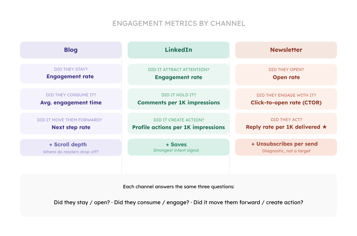
There are many metrics you can track to measure your blog performance. But you don’t need dozens of metrics. I suggest a few that clearly show where the content is working and where it’s breaking.
1. Did they stay? → Engagement rate
In GA4, this metric measures the percentage of sessions that qualify as “engaged,” meaning the user stayed on the page for more than 10 seconds, triggered a conversion event, or viewed at least two pages. You can find it under Reports → Engagement → Pages and screens (add it as a column if needed) and filter by your blog URLs. This metric tells you whether the article delivers on the promise made by the headline. If people click and immediately leave, GA4 won’t count that as engaged.
If your engagement rate is low, tighten your headline, align it more closely with search intent, and rewrite the introduction so readers instantly see they’re in the right place.
Here are some benchmarks for the engagement rate to pay attention to:
2. Did they consume it? → Average engagement time
This is the clearest signal that readers are actually reading. In GA4, it's called 'Average engagement time,’ which measures how long users actively spend on the page (while it’s in focus). Aim for >90 seconds for long-form content (1,000–1,500+ words). Below ~60 seconds usually means the intro failed to earn the scroll.
If your engagement time scores under 60 seconds, the intro didn't earn the scroll. The reader landed, skimmed the opening, and decided it wasn't worth their time. Fix the first three sentences. Cut the warm-up, lead with the tension or a specific problem, and make the reader feel like they're already in the middle of something useful.
If engagement time is between 60 and 90 seconds on a 1,500+ word piece, they read the intro and stopped somewhere in the first third. The opening worked but the transition into the core didn't hold. Look at your first H2. Does it deliver on the promise of the intro?
Benchmarks:
3. Did it move them forward? → Next step rate
It isn’t a default GA4 metric, but one you define by tracking a key follow-up action. This can be clicking an internal link, signing up, or navigating to another page, and dividing those events by total users on the article. In GA4, you can measure this by setting up events (e.g., internal_link_click or sign_up), marking key ones as conversions, and then analyzing them in Explore → Funnel or Path exploration or by filtering conversions by page path.
If it’s low, strengthen internal linking, add clearer and more compelling CTAs, and guide readers toward a logical next step that naturally follows from what they just read.
Benchmarks:
For TOFU content even 3–5% is fine. For BOFU, expect higher (10%+).
Same logic with Linkedin content. You want answers to the following questions:
1. Did it attract attention? → Engagement rate
Engagement rate measures the percentage of people who interacted with your post after seeing it, making it a strong indicator of whether your content earned attention in the feed. On LinkedIn, this includes reactions (likes), comments, reposts, and clicks, all relative to total impressions. Unlike raw impressions, which are driven by distribution, engagement rate reflects how compelling your hook, topic, and framing are to the audience that saw the post.
To track it, you’ll need to calculate it manually using your post analytics. Take the total number of
social engagements (reactions + comments + reposts + saves + sends on LinkedIn) and divide it by impressions, then multiply by 100 to get a percentage. You can pull all of these numbers directly from LinkedIn’s post analytics view.
If engagement rate is low, the issue is almost always at the top of the post. Focus on strengthening the first two lines. For example, you can make the audience explicit (“if you’re a B2B marketer…”), introduce tension or a problem, and avoid generic openings.
Benchmarks:
Most B2B posts sit at 1-3%.
2. Did it hold it? → Comments per 1,000 impressions
It measures how many people felt compelled to respond to your post, normalized by reach. Comments are the highest-quality signal on LinkedIn because they require effort.
To track it, divide the number of comments by total impressions and multiply by 1,000. This normalization allows you to compare posts regardless of how widely they were distributed.
If this metric is low, your content may be informative but not engaging enough to provoke a response. Strong commenting behavior comes from posts that are opinionated, relatable, or slightly polarizing. In short, move from “useful” to “discussable.”
Benchmarks:
3. Did it create action? → Profile actions (profile views, follows) per 1,000 impressions
Profile actions measure whether your post drives people to take a next step such as visiting your profile or following you. While engagement and comments reflect content performance, profile actions reflect creator positioning and long-term value.
To track this, sum profile views and follows, divide by impressions, and multiply by 1,000. LinkedIn shows profile views and follows attributed to each post (depending on your analytics setup), making it possible to see which posts actually drive audience growth.
If profile actions are low, your content may be interesting but not distinctive or memorable. People consume it and move on. To improve this, sharpen your positioning: make your perspective, expertise, or angle more explicit within the content. Share how you think, not just what you know. Over time, consistent signals about what you stand for make people more likely to click through and follow.
Benchmarks:
For newsletters, the questions you want answers to include:
1. Did they open? → Open rate (%)
A consistent open rate above 35-40% for a B2B newsletter with an engaged list is a healthy signal. Evaluate it per send and track trends over time. Also, compare performance across different subject line styles (curiosity-driven, benefit-driven, personal, etc.) to understand what resonates with your audience.
If the open rate is declining over time, your subject lines have become predictable. Readers know what they'll get, and it's not urgent enough to open now. Vary your subject line structure. Try a question, a number, a one-word teaser, or something that sounds personal. Also check your send time and frequency: declining opens can signal fatigue.
Benchmarks:
If you have a small list of subscribers, expect higher open rates. If your list is large, the open rate is usually lower.
2. Did they engage with it? → Click-to-open rate (%)
The engagement signal in a newsletter is whether readers clicked through after opening. Click-to-open rate (CTOR) measures clicks relative to opens, making it a better indicator of content performance than clicks over delivered emails.
A high open rate with a low CTOR means the subject line worked, but the content didn’t earn further action.
If the CTOR is low, either the CTA isn’t clear, it’s placed too late, or the content before it didn’t build enough momentum to make the click feel like a natural next step. Move the CTA earlier, or add a sentence that makes the stakes of clicking explicit.
Benchmarks:
3. Did they act? → Reply rate per 1000 newsletters delivered
The most underrated newsletter metric. When readers reply to your newsletter, they are treating you as a person they want to have a conversation with. This is the metric that most directly signals trust.
To track this, divide total replies by delivered emails and multiply by 1,000. This makes the metric easier to interpret and compare across campaigns.
Replies drop when content becomes less personal, more polished, or more generic. Write one issue as if you're writing to one specific person, add personality, make it imperfect, and see what happens. The goal is to make readers feel like they’re part of a dialogue, not just consuming content. Over time, higher reply rates indicate audience trust.
Benchmarks:
There are other useful metrics you can track. If I were to choose one more per channel, that would be scroll depth for blog, saves for LinkedIn and unsubscribes per send for newsletter. Let's talk briefly about them.
1. Scroll depth for blog. Scroll depth tells you how far readers get before leaving. GA4 fires a default scroll event at 90% scroll, meaning you can see what percentage of readers reach the bottom of each page.
If 80% of visitors stop at the 40% mark on a long-form page (1,000+ words), it's a content problem. Something in the middle third isn't earning the next scroll. Use this to identify where readers are dropping off and improve pacing, add examples, or restructure sections.
Scroll depth also tells you where to place your CTAs. A button at the bottom of a page that 95% of readers never reach isn't a good idea. Put your most important CTA at the point where an engaged reader would logically want to act.
If scroll depth drops sharply at a specific point, something in that section broke the rhythm. Common causes: a paragraph that's too dense, a section that repeats what was already said, or a transition that loses the thread. Read just that section out loud. If it doesn't flow, it won't scroll.
2. Saves for LinkedIn. Underused. When someone saves a post, they're signaling genuine intent to return to it, and it's a stronger signal than a like. For writers publishing on personal pages, this is worth tracking. Low saves usually mean the post was entertaining but not actionable. Add a framework, a checklist, something worth returning to.
3. Unsubscribes per send for newsletters. A spike in unsubscribes after a particular send tells you something about audience fit or content relevance that no other metric shows as clearly. If the unsubscribe spikes after a specific issue, ask: did the topic match what this list signed up for? Did the tone shift? Did it feel promotional? A single spike is usually a topic mismatch. Recurring spikes mean audience drift, the content has moved away from who originally subscribed.
Yes, volume matters. But only when it's quality-gated…and the definition of "volume" has changed.
In 2022, six long-form articles a month was the benchmark for a good in-house B2B writer. That number assumed the writer was doing the research, structuring the piece, and producing the draft mostly from scratch.
Today, an average writer with AI assistance can produce that volume in half the time. Which means the number itself tells you very little.
What actually signals strong performance now:
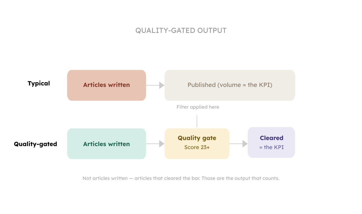
For teams using AI tools to assist with research and drafting, the output number can reasonably be higher. But the quality gate becomes more important. There is a risk that the volume increase comes at the cost of the very things that make content worth reading. If you're seeing output go up and engagement go down, you're probably measuring the wrong thing.
You don't need a complicated system. Here's how to introduce the quality score without making your writers feel audited:
The goal is giving writers a target, and giving you a signal about content performance.
Download the content quality scorecard
Watch it instead:
Please fill in our survey to help us shape the report about how AI changed things in content teams. I'll share the results as soon as we're done with it.
In the next two issues I'll go deeper on what good actually looks like, why Originality is the dimension that matters most right now, and what happens when the person running the scorecard doesn't know what expert content really means.
Kateryna
P.S. If we aren't connected already, follow me on LinkedIn and Instagram. If you like this newsletter, please refer your friends.
P.P.S. Need help with quality content? Zmistify your content with Zmist & Copy


"It’s important to argue logically because logic is an essential part of argumentation." Is this sentence logically sound? Not really. Logic can go wrong in many ways. And sometimes we don't even realize that the point we’re making isn’t that strong. Read this article to learn common mistakes in reasoning and how to avoid building bad arguments.

Services vs Software (inspired by services as software companies and AI-native services firms)
Subscribe to From Reads to Leads for real-life stories, marketing wisdom, and career advice delivered to your inbox every Friday.